I’m always in two minds about Versace‘s shows. Are they so wrong they’re right? Yes, on occasion they are. Are they sometimes just plain wrong? Yes, occasionally they really are. Sadly I can’t say I’ve liked a collection for quite some time now and the past two seasons have been particularly offensive to my retinas. The Spring/Summer 2012 collection doesn’t have quite such an abrasive effect on my eyeballs as the past two, but it doesn’t fill with me barrels of bejewelled love either.
There’s a clever aspect to the designs in this collection for sure and it wont take a genius to see the similarity of some of the pieces to the forthcoming Versace for H&M collection, in fact some the studded dresses are almost identical. So you could purchase yourself a studded shift dress from the much cheaper high street collection, and pretty easily pass it off as a Spring/Summer 2012 main line piece a few months down the line. I suppose that’s going to be put down to a simple case of the Versace DNA flowing through both collections, but to me it seems a bit more deliberate. Whether the Versace customer is going to appreciate that I’m not sure.
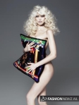
What begins as an almost solidly white collection slowly (very slowly) moves into incorporating some muted shades of green, yellow and blue. They kind of remind of very washed out highlighter colours, and they can quickly become a bit…sickly? My main problem with the collection as a whole is exactly how repetitive it was. The same jacket, bandeau top and skirt seemed to appear in far too many variations, and then the prints. The prints. Seahorses, shells, and various other underwater creatures makes up the collection’s prints – again appearing in washed out highlighter-esque shades. To me, they’re just not right. I enjoy when Donatella really embraces the Versace brand and it’s history and brings us the full, tacky nature of the brand. I enjoy that tack, when it’s bold and fully knowing of the fact it appears that way? This however is just odd to me. There is a tacky quality to the gowns, but sadly not in the good way, starfish jewelled appliques?
I have asymmetrical issues. It’s something I’ve worked to try and conquer but to no avail. Asymmetrical details such as these odd pleated sections drive me INSANE. Why? Why are they there? Baffled.
It probably seems like this is an entire post bashing the collection and perhaps Versace in general, but I really want to stress that as a brand I’m actually quite a fan. When it goes the distance and embraces their ideals fully. If you’re going to do something quite so tacky, then hit it head on. Be unashamed. The Versace girl is never ashamed, so why should the designs be? Bring on the Versace for H&M collection I say, it looks much stronger than this collection for sure.


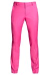
 Not content with having one sell out collection, Donatella Versace also designed a Spring collection for the high street giant H&M, due into stores in the new year. As you can see, Donatella was feeling somewhat fruity! The collection features white cropped jeans, fruit print swimwear, a fruit print hold all, and my personal favourite womenswear piece of the entire collection – a printed chiffon blouse with gold buttons on the shoulders.